


The club’s crest
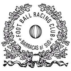
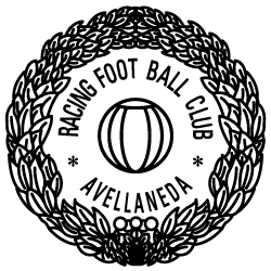
Right from its founding, the club used different symbols to identify its official documents. This can be found in the club’s first book of records, whose pages bear a laurate crest seal in which an early 20th century football is seen together with the words “Foot Ball Racing Club – Barracas al Sud”, which was Avellaneda’s name until 1904. This seal is the first symbol of identity in Racing’s history. Years later, in 1912, according to the club’s official correspondence, a similar version of the previous seal was created, but with different laurels and the inscription “Racing Foot Ball Club – Avellaneda”. The first pictures of Racing’s symbols appear in the 1910’s, where a monogram consisting of the initials “R.C.” could be found. That same monogram was part of the decoration in the windows and front doors of the Avellaneda offices until the late 1920’s. Several of these monograms are still preserved as moldings, displayed in a similar way to the club’s current crest.
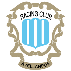
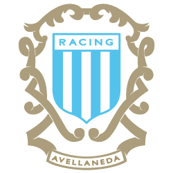
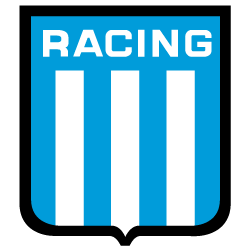
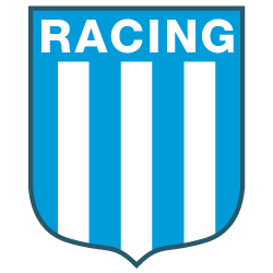
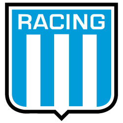
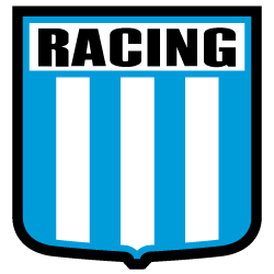
The club’s crests
-
 1903
1903 -
 1912
1912 -
 1918
1918 -
 1920
1920 -
 1928
1928 -
 1929
1929 -
 1934
1934 -
 1936
1936 -
 1941
1941 -
 1950
1950 -
 1967
1967 -
 1974
1974 -
 1990
1990 -
 1995
1995 -
 1995
1995 -
 1998
1998 -
 1999
1999 -
 2001
2001 -
 2003
2003 -
 2004
2004 -
 2006
2006 -
 2007
2007 -
 2009
2009 -
 2012
2012 -
 2014
2014
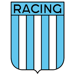
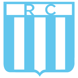
The first crest
In 1929, Racing officially adopts the emblem as the club’s first crest.
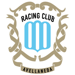
The crest makes reference to the city of Avellaneda and the club’s full name: Racing Club, which is placed outside the sky blue and white vertical stripes, surrounded by ornamentations. That same crest was found in letterheads and in membership cards at least until 1934.
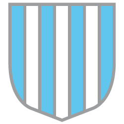
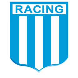
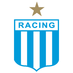
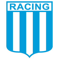
Later, by the mid 1930’s, the crest evolves: the crest as we know it today was created but it was surrounded by ornamentations similar to the previous version.
The first changes
In magazines and newspapers of 1940, athletes of several disciplines can be seen wearing a version of the crest quite similar to our current crest.
One year later, under Luis Carbone’s administration, the crest was displayed in the front cover of the club’s annual report just like it was described in the club’s bylaws (See “Club’s bylaws”).
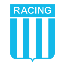
With the passing of time, different versions of the club’s crest were created, following the graphic styles of each decade.
In 1950, the crest was fixed to the base of the mast of the new stadium with an identical proportion of width and height, with the word “Racing” being replaced with the initials “R.C.”. After that, several versions of the crest appeared over time, maybe as adaptations of the liking and style of the illustrator in charge, always with its seven vertical stripes and many times altering the colour order for no reason in the upper side, or even the colour and typography of the name.
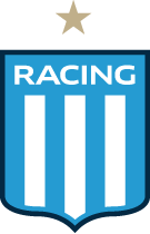
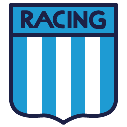
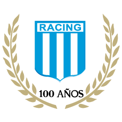
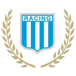
In 2001, the most updated version of the crest was created, to which, two years later, gold laurels and the words “100 years” were added to celebrate the club’s centenary.
Also, in 2007, a star was added in the upper side of the crest, in commemoration of the 40th anniversary of the winning the Intercontinental Cup.
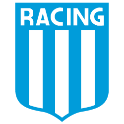
Our identity
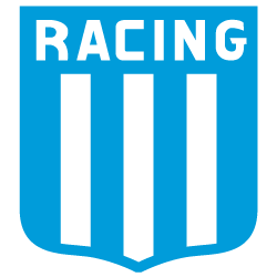
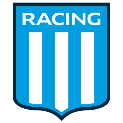
Finally, in 2009, with the purpose of restoring our history, the crest was adjusted to take the new proportion set forth in the club’s bylaws. In addition to this, the seven sky blue and white vertical stripes were adjusted to the same proportion (2.5x3). An official hue of sky blue was established and incorporated into the first identity manual of the club.
By late 2013, with a consolidated brand and with the purpose of creating a more modern and aggressive image, Racing redesigned its crest, developed by the Marketing Department, thus having a greater visual impact in the team’s jersey, the club’s facilities and official merchandise.
The club’s bylaws
In Section 5, the guidelines for the club’s crest are set forth:
“The social badge shall be a vertical rectangular crest with a proportion of three to two and a half with a sky blue background, straight on its upper edge and on both sides, the angles of which are cut in their base by two soft curves starting from the sides and joining in the middle, forming a small peak in the lower side.
In the upper part, on the sky blue background, the word “Racing” shall appear and below that part there shall be seven stripes of equal size vertical to the base in alternation of sky blue and white. In other words, four sky blue and three white stripes, with the sky blue stripes on each side.
The colours shall be separated by a black line.”